This is one of projects I did when I was working at Naver Corp as a UX Researcher.

As a representative news media platform in Korea, Naver Corporation offers consistent national election information services, in the collaboration with primary broadcasting companies. In 2012, Korea had their 19th National Assembly Election. My team was responsible for the UX research & design of a PC and mobile for the election. I was in charge of the mobile service.

Participation
Mobile UX Research & Design: 95%PC UX Research & Design: 15%
Challenges & Solutions
The project had a high level of difficulty with massive and sensitive raw data related to the election. Here are major challenes the project embedded, and the solutions I implemented.1. Offering timely information
Since important information is different dependig on time--before the election, during the voting, after exit polls, during the vote counting, and after the counting--offering timely information for each moment was the most important and complicated issue.
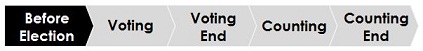
In my UX documentation, the tag above was used for each screen and function to mark when each element should be pushed live on the server. In addition, I specified the services' status and data, needed according to the election schedule, in great detail. Plans for each time slot on the timeline was visualized and shared to other related departments. According to the plan, the task force team, consisting of planners, UX designers, UI designers, developers, and content editors, rehearsed the real situation several times. On the election day, we could offer the service successfully.
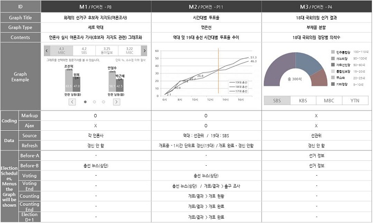
2. Use of effective infographics to visualize numerical data
As there is considerable numerical data in elections, it was important to visualize the information in a proper format. The infographic had to be simple, fit for the data, easy to develop, visible in mobile screens, and visually attractive. I devised various kinds of infographics for different usages with co-workers. All infographics were defined in detail--which data is used, where the data are comes from to a database, metrics, time slots and menus that each infographic will be shown, exceptional cases, and so on--for facilitating communication with UI designers, deveopers, and contents editors. Fifteen infographics were defined, and the picture below is parts of the documentation.